Google Nexus 4 Review - Google's new Flagship
by Brian Klug on November 13, 2012 8:45 AM EST- Posted in
- Smartphones
- LG
- Android
- Mobile
- APQ8064
- Nexus 4
- Android 4.2
- MDM9215
The Nexus One was a groundbreaking device. It was the defining moment that Google got serious about making both a real consumer electronic, and pitting the Android platform against the incumbent iOS. While you could make the case that the original T-Mobile G1 was the original Google phone, it really was with Nexus One that Google set out on its path for defining a smartphone platform and distribution model of its own.
While the success of that particular handset was limited and Google’s aspirations perhaps a bit unrealistic, the truth is that the Nexus platform itself has been a growing success. Each year we see essentially the same pattern — Google chooses one OEM, one SoC vendor, and sets the Android team free toward building a tailor-made version of the next major release of Android for that combination. We’ve now had three generations of Nexus smartphones, with the Nexus 4 deriving its name from the obvious fourth incantation of the same goal — an unadulterated version of Android free from OEM skinning and carrier politicking.
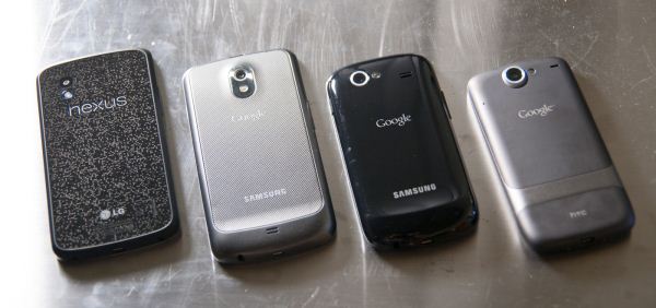
Left to right: Nexus 4, Galaxy Nexus, Nexus S, Nexus One
A little over a month ago, LG flew me to Korea to check out the LG Optimus G, their latest smartphone based around Qualcomm’s APQ8064 quad core Krait SoC and MDM9x15. The combination of those two alone already were enough to excite me purely because I was eager to see who would be first to market with an APQ8064 handset. Myself and a number of other western tech press were given LG Optimus Gs to play around with for a week on Korean LTE network U+, and while I’m still working on my review of a Korean version of the Optimus G, that particular hardware is surprisingly great.
While I was on that trip, I heard that a smartphone based on the Optimus G would be the next Nexus phone and was quite simply blown away. Nexus has rarely been first to the latest and greatest in terms of hardware platforms, and certainly there was no way that combination would be inexpensive. For Google to nail the next Nexus phone it would have to be a combination of both. At the time I joked that the G in Optimus G stood for Google (among a few other things) and anxiously awaited the final hardware. The next real question was what balance of both Nexus DNA and LG’s own would combine to form the next Nexus handset. In the case of the Nexus 4, the blend is almost exactly one part Google Nexus, one part LG Optimus G, and that’s honestly a very good thing.
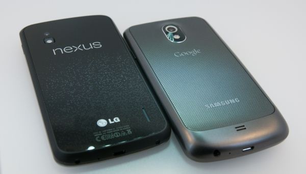
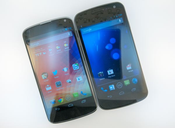
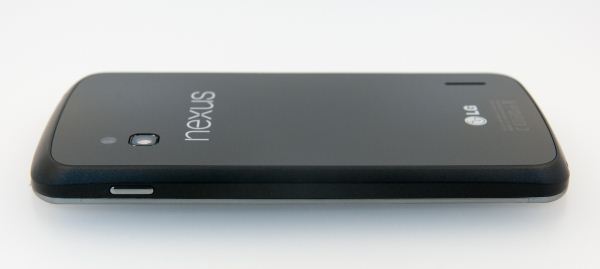
The Nexus 4 is undoubtedly based on the Optimus G, but it isn’t nearly as obvious as you’d think. Where the Optimus G is a very square and rectangular phone, the Nexus 4 preserves the rounded gentle curves and overall shape of the Galaxy Nexus. In fact, side by side with the Galaxy Nexus, the Nexus 4 almost looks like it has the exact same shape, save being slightly wider and flatter. Material choice is also undoubtedly better than the Galaxy Nexus, which was a decidedly Samsung-y combination of polycarbonate plastic and soft touch battery cover. This is where the Nexus 4 deviates from the Optimus G as well — around the edge and below the chrome is a rubbery soft-touch band that extends to the glass back. It’s this rubber perimeter that forms the majority of the in-hand contact with the Nexus 4, and results in a great grip and excellent in hand feel. My fingers wrap perfectly around to the rubber lip on the other side making holding the Nexus 4 feel very secure. Google talked a lot about how the majority of their work with ASUS on the Nexus 7 was getting the edge chamfer correct and adding a textured pattern to the soft touch material, which made that device feel classy in spite of having a solid plastic back that actually was a snap-on construction. It’s clear to me that the same emphasis was placed on the Nexus 4 as well, as this in-hand feel is flawless here, where so many other handsets come off feeling plasticky. It’s always interesting how build quality doesn’t necessarily map one to one with in-hand feel. In the case of the Nexus 4 however I believe both are rock solid.
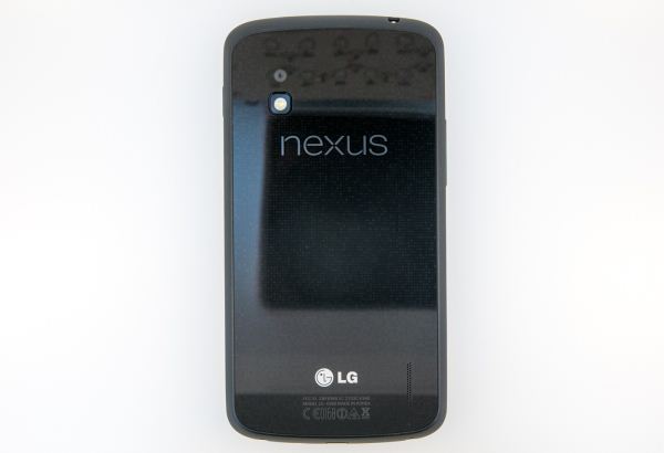
Like the Optimus G, the Nexus 4 backside is one unbroken piece of glass, which is bound to elicit strong feelings from everyone. The Optimus G and Nexus 4 both use the same type of glass on the front and back — Corning Gorilla Glass 2. Having a glass back definitely is eerily reminiscent of the iPhone 4/4S era design, but does add a certain level of rigidity to the device without adding a lot of thickness, and again also is RF transparent, which is important in a device that combines both NFC, Qi Wireless charging, WiFi, Bluetooth, and pentaband WCDMA. Having the glass back was something LG felt strongly about for the Optimus G and does anchor the Nexus 4 back to that design, so I have a feeling that there were strong feelings about this on LG’s part for preserving some of the original Optimus G industrial design. The problem with large plane-defining glass surfaces is if the handset gets placed flat on a surface it often can pick up fine scratches (called sleeks) from even dust or grains of dirt between the interface and the glass. I wish the Nexus 4 had a larger lip between the glass and the circular rubber band to raise the glass further away from surfaces and prevent annoying sleeks from forming. On my Nexus 4 review unit the lip is quite thin, definitely under a millimeter, and there are already a number of sleeks.
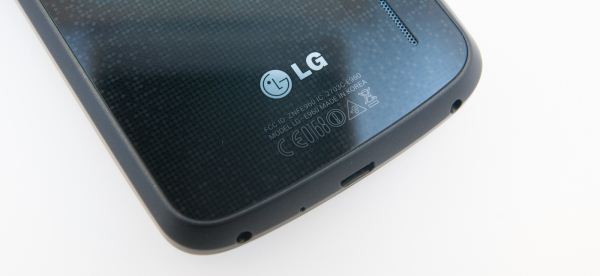
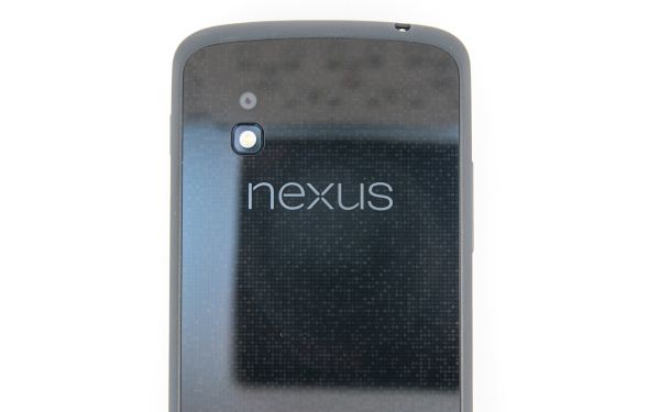
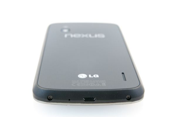
Underneath the glass is the same ‘crystal reflection’ treatment as the Optimus G which creates a unique reflective shimmery appearance under different angles of incident light. The pattern on the Nexus 4 is different from the 3D Escher-esque repeating diamonds on the Optimus G. Instead the Nexus 4 has a grid of repeating sparkling circles which reflect at different random angles all over the back, which look spectacular under the right incident angles. It really does look striking under different kinds of direct lighting. Google has also now replaced the “Google” on other Nexus devices with the word “Nexus” on the entire new lineup, and this along with LG at the bottom are the only markings on the Nexus 4 other than the regulatory markings. It’s an odd decision to see no more Google branding anywhere on the handset given its presence on the previous three Nexus phones, but Google is trying hard to build the Nexus line as its own brand and this is the right way to do it.
Alongside all the other Nexus phones we can see that Google has done a pretty good job keeping their own industrial design around. Rounded edges with a large radius gets kept around, as does the primarily black or dark grey color scheme. The Nexus 4 does away with the chrome ring around the camera aperture, however. Again the largest deviation is the removal of “Google” branding in place of “Nexus” on the backside.
There’s a vertical slit for the speakerphone on the back at bottom right. Top left is where the Nexus 4 locates the 8 MP camera and LED flash. This is the same camera module and system as what’s in the 8 MP LG Optimus G configuration, which has no bulge at all. Only the 13 MP system (which is an option) has a bulge.
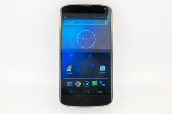
The Nexus 4 eschews the face-hugging curved glass which begun with the Nexus S, carried over to the Galaxy Nexus, and always struck me as being a bit of a gimmick. It might have made the phone slightly more ergonomic during phone calls, but really most of smartphone use these days isn’t calling, it’s interacting with the display. Moreover, that vertical curve always did create some weird total internal reflections in the glass that constantly bugged me when the sun was at a critical angle. Instead the Nexus 4 has a small radius of curvature lip at the left and right side, making interacting with the extreme left or right easy. My fingers roll off the left or right instead of into a sharp plastic ridge like with the Galaxy Nexus.
The other common design element between the Optimus G and Nexus 4 is that nonconductive metallic plastic ring which extends around the perimeter of the device. This is something that comes off as tacky in the US market but (I’m told) is still a somewhat attractive motif in the Korean market. There’s actually a process whereupon the plastic is impregnated with this nonconductive silvery material, and again it has to be nonconductive to not impact any RF characteristics of the handset. The front facing camera is top right, in the same position as the Galaxy Nexus. Earpiece is a recessed notch at the top between the chrome lip and the glass. Oh, and the Nexus 4 still contains the same three-color notification LED bottom center as the Galaxy Nexus, which is just as well done and disappears into the black surrounding material when not glowing.
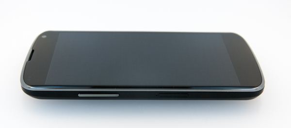
Button placement on the Nexus 4 is the same as the Galaxy Nexus, with a volume rocker at left, power/standby at right. For ports, everything is mostly the same, with microUSB at the bottom and a microphone pair (one primary microphone at top, one secondary at bottom for noise rejection). Nexus 4 does mix things up and stick the headphone jack at the top as opposed to the bottom which Galaxy Nexus went with.
The Nexus 4 lacks a removable battery door, although the back of the phone is easily separated from the rest of the phone by removing the two Torx T4 bits at bottom and prying up with a plastic separator tool or guitar pick. Underneath is a 2100 mAh 3.8V battery (8.0 Whr) battery and the numerous antenna connector springs required to connect to the inductive antenna coil for NFC, wireless charging, cellular diversity, and WLAN/BT. The Nexus 4 also moves the land of Nexus to a microSIM via an ejectable tray in place of the miniSIM used on its predecessors, so people upgrading will either need to borrow a SIM cutter or make a trip to their local carrier store for a new micro sized USIM.
| Physical Comparison | ||||
| Apple iPhone 5 | Samsung Galaxy S 3 (USA) | Samsung Galaxy Nexus (GSM/UMTS) | LG Nexus 4 | |
| Height | 123.8 mm (4.87") | 136.6 mm (5.38" ) | 135.5 mm (5.33") | 133.9 mm (5.27") |
| Width | 58.6 mm (2.31") | 70.6 mm (2.78") | 67.94 mm (2.67) | 68.7 mm (2.7") |
| Depth | 7.6 mm (0.30") | 8.6 mm (0.34") | 8.94 mm (0.35") | 9.1 mm (0.36") |
| Weight | 112 g (3.95 oz) | 133g (4.7 oz) | 135 g (4.8 oz) | 139 g |
| CPU | 1.3 GHz Apple A6 (Dual Core Apple Swift) | 1.5 GHz MSM8960 (Dual Core Krait) | 1.2 GHz OMAP 4460 (Dual Core Cortex A9) | 1.5 GHz APQ8064 (Quad Core Krait) |
| GPU | PowerVR SGX 543MP3 | Adreno 225 | PowerVR SGX 540 @ 304 MHz | Adreno 320 |
| RAM | 1 GB LPDDR2 | 2 GB LPDDR2 | 1 GB LPDDR2 | 2 GB LPDDR2 |
| NAND | 16, 32, or 64 GB integrated | 16/32 GB NAND with up to 64 GB microSDXC | 16/32 GB NAND | 8/16 GB NAND |
| Camera | 8 MP with LED Flash + 1.2MP front facing | 8 MP with LED Flash + 1.9 MP front facing | 5 MP with AF/LED Flash, 1080p30 video recording, 1.3 MP front facing | 8 MP with AF/LED Flash, 1.3 MP front facing |
| Screen | 4" 1136 x 640 LED backlit LCD | 4.8" 1280x720 HD SAMOLED | 4.65" 1280x720 SAMOLED HD | 4.7" 1280x768 HD IPS+ LCD |
| Battery | Internal 5.45 Whr | Removable 7.98 Whr | Removable 6.48 Whr | Internal 8.0 Whr |
Overall the Nexus 4 hardware impresses me quite a bit. The Galaxy Nexus couldn’t ever quite shake the plasticky feeling for me, in spite of Samsung including a battery cover with soft touch material and texture. The odd thickness of the Galaxy Nexus always also bugged me. With almost the same overall dimensions and shape, the Nexus 4 pulls off a much more sophisticated in-hand feel with the rubber perimeter, and I’m willing to deal with the glass back in light of the alternative. The part about removable battery covers is a worthy complaint, though we’re seeing all OEMs head in this direction gradually in an effort to deliver smaller and smaller profiles. In addition, the microSD card ship sailed a long time ago for Nexus phones (back in the Nexus S days) and wasn’t ever coming back. The front glass roll-off at left and right on the display contrast starkly to the Galaxy Nexus’ sharp plastic ring and really help the Nexus 4 feel great.
I’m very impressed with the direction that Google is taking Nexus in general. The Nexus 7 was impressive to me with its design and attention to in-hand feel, and the Nexus 4 is likewise a substantial improvement over the Galaxy Nexus. The Nexus 4 is also simultaneously different enough from the Optimus G to not be either confused with it or be accused of just being a reused design.




188 Comments
View All Comments
numberoneoppa - Tuesday, November 13, 2012 - link
Lovely review, Brian, as usual, but I have a question. Forgive me if I just glanced over this, but have you run your benchmarks using the newest OTA which rolled out over the last day or are these running the same software as those posted earlier in the month? In any case, it would be interesting to see if there are any changes in the XML file which seems to specify temperature shelves.Jorange - Tuesday, November 13, 2012 - link
Hi Brian,Can you please confirm that all GL Benchmark tests are run serially for all devices?, as this places them under a greater thermal load, then running the benches individually.
Brian Klug - Tuesday, November 13, 2012 - link
I do whenever possible, always. The issue is what happens when devices crash out before a full run (Optimus G) which then forces my hand to do this piece-by-piece kind of testing and reassemble a whole run.-Brian
MadMan007 - Tuesday, November 13, 2012 - link
You should note which devices have 'assembled scores' versus straight runs in your charts then. An asterik would do.xTRICKYxx - Tuesday, November 13, 2012 - link
By far the best Nexus 4 review; bar none.Kernel developers will easily raise the thermal throttling limit to a much higher temperature, but it is obvious there is a temperature issue.
suhan - Tuesday, November 13, 2012 - link
why is it that you don't use geekbench to measure the actual performance of the device?tuxRoller - Tuesday, November 13, 2012 - link
Because it is closed source thus we dont know exactly what paths it takes (meaning it could disproportionately harm one particular device over another)?Hell, do we need even know what compiler they use? Knowing that and the flags used would certainly be very useful.
HisDivineOrder - Tuesday, November 13, 2012 - link
...this site used to be about custom-built computers?We'd get driver reviews, we'd get hardware other than video cards, motherboards, and CPU's reviewed, we'd get the skinny on new custom PC hardware that was coming...
I'm waxing nostalgic here. I miss those days, I think. These smartphone reviews are just beginning to bore me to tears. Maybe I'm just old, but I miss the good ol' days. Back when phones were something we just lived with rather than something people seem to obsess over now.
Back when having the latest and greatest in computing was more about smart hardware selection and less about going to the store, slapping down your cc, and saying, "Gimme your best, barkeep!"
Medikit - Tuesday, November 13, 2012 - link
I remember those days really well. Mobile computing is the future of the industry. Furthermore Anandtech still reviews computer cases, HTPCs, and the latest, greatest hardware. I like to think of it as the best of both worlds.Alexo - Thursday, November 15, 2012 - link
> Mobile computing is the future of the industry."Mobile computing" will not get truly mobile until we get decent battery life.
Meanwhile, AnandTech keeps lauding devices that have more computing power than most of us ever utilize at the expense of battery life (not to mention non-user-changeable batteries, throttling, etc.)