HP Announces ZBook x2: HP's First Detachable Workstation
by Joe Shields on October 18, 2017 7:00 AM EST- Posted in
- Laptops
- HP
- Workstation
- detachable
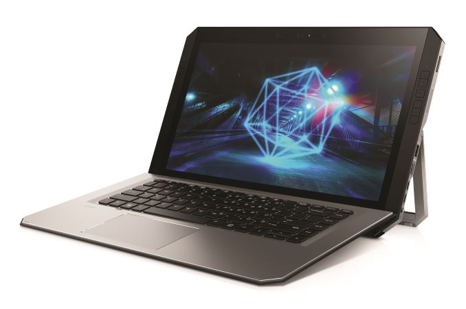
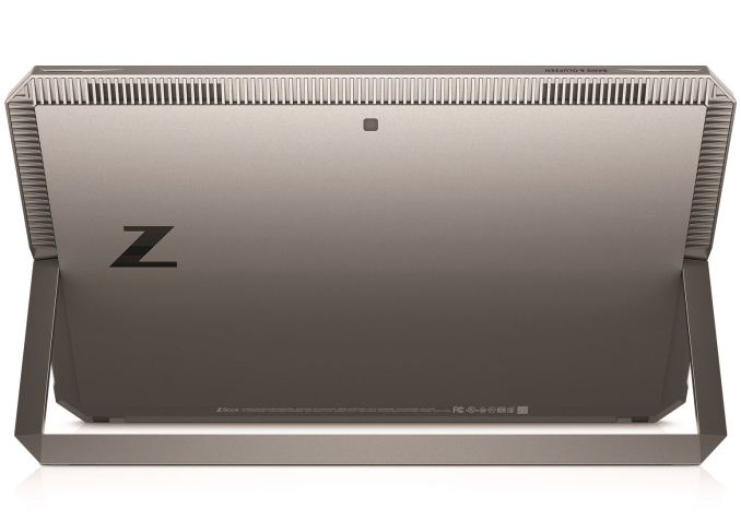
Today at the Adobe MAX conference in Las Vegas, HP will showcase their new HP ZBook x2. The ZBook x2 will be HP's first detachable PC workstation, and, HP claims, the most powerful. The new ZBook x2 is the latest of several detachable PC releases from HP that started earlier this year. The HP Spectre x2 and HP Elite were introduced earlier with an updated appearance and hardware specifications. HP’s goal with the ZBook x2 was to maintain creative workflows for artists, designers, and digital imaging professionals, and increase productivity without leaving their creative flow to do so.
For their latest worktation-class product, HP worked with customers from amateurs to professionals in determining workflow bottlenecks and how to get around them. What they found was an age-old complaint: devices were not delivering the performance users wanted, and lag plus instability further hurt usability. Their blueprint to fix these problems is to have a better application experience, better visualizations, and higher reliability for increased productivity.
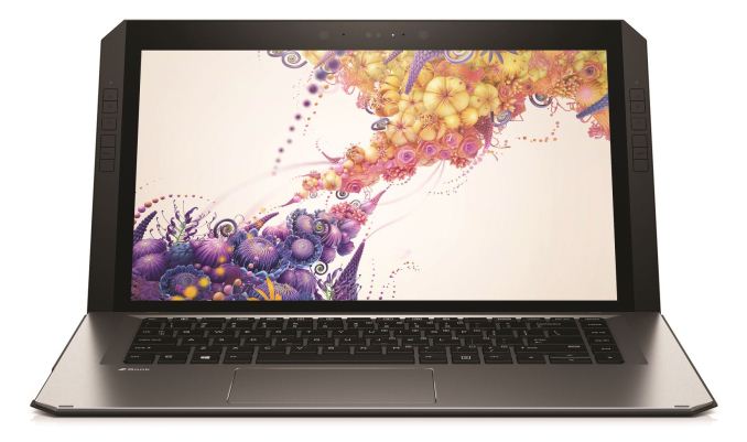
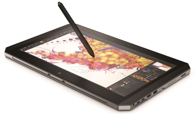
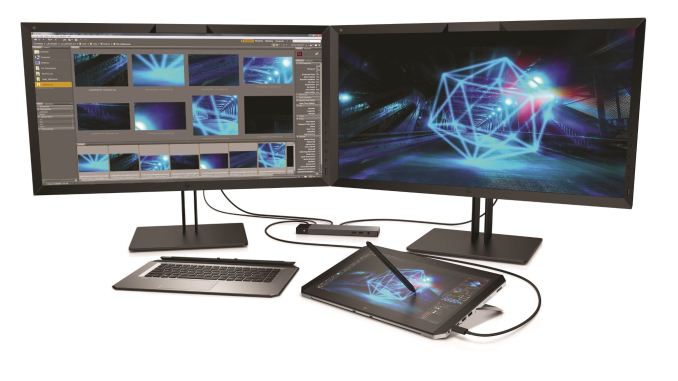
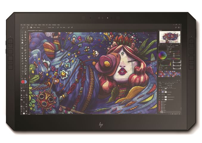
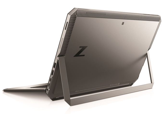
HP took the ZBook x2 and, working closely with Adobe, optimized it for Adobe's CC apps. It has four modes, Table Mode (Capture), Detach mode (create), dock mode (produce), and Laptop mode (review) allowing for a lot of versatility using its integrated stand, detachable keyboard, pen, and touch-enabled display. The display is a 14” 4K UHD Dreamcolor unit; a 10 bit display (8 bit + FRC) supporting 1 billion colors and 100% Adobe RGB with factory calibration.
It is pen and touch-enabled and comes with an anti-glare coating to minimize reflections in bright ambient light. On both sides of the display are 18 quick keys; these quick keys offer 3 preset shortcuts for Adobe Photoshop, Illustrator, and Lightroom. When working in tablet mode, users have access to their shortcuts without a keyboard using these keys (programmable as well) which keeps efficiency intact. The pen itself uses a passive, battery-less technology (Wacom EMR)- never needs charging, claims to have virtually zero latency, and has a total of 4,096 pressure sensitive levels. Unfortunately, the pen does not come with the device and is sold separately.
The aluminum decked backlit LED keyboard, HP says, is a full-size commercial keyboard made mobile. The keys sport 1.5mm travel and 18.7mm pitch and is detachable for additional freedom of use. Connectivity between the system and keyboard is via Bluetooth when not connected. The monitor also has three webcams: two front-facing 720p, one with IR capabilities, and an 8MP world facing camera. With the front IR camera, the device is capable of supporting Microsoft Hello.
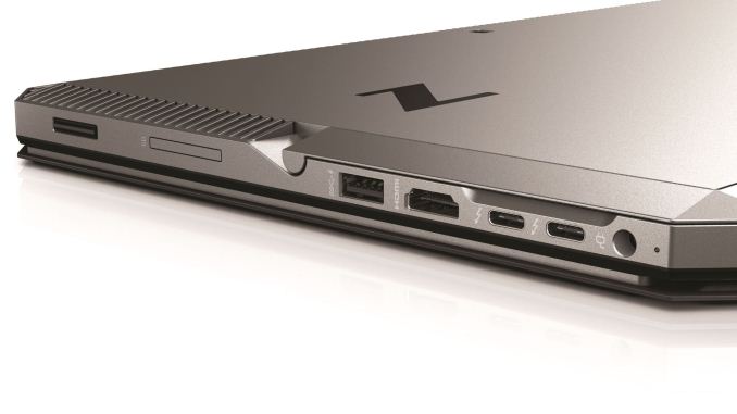
Internally, the ZBook x2 supports both 7th and 8th generation Intel CPUs from the i7-7500U to the i7-8650U. The flagship CPU, i7-8560U, comes in with a base clock of 1.9 GHz and boosts up to 4.2 GHz. Memory capacity is up to 32GB DDR4-2133 non-ECC SDRAM across 2 SODIMMs. 32GB of ram is double what most other detachables provide helping with multitasking and large file manipulation. Internal storage options range from a 128GB M.2 SATA SSD, up to 2TB PCIe NVMe M.2 SSD. Internal storage is not user upgradeable, however, there are two Thunderbolt 3 ports for additional external connectivity as well as a USB 3.0 Type-A port, which HP lists as having "charging" capabilities.
Available graphics include the Intel HD 620 or UHD 620 built into the devices CPUs, or a discrete GPU as an option in the NVIDIA Quadro M620 (2GB GDDR5 dedicated). Networking capabilities are all wireless and handled by the HP HS3110 HSPA + Intel Mobile broadband module. It is dual-band wireless AC and supports Bluetooth 4.2. In order to keep these devices cool, HP reinvented their cooling solution for the ZBook x2. Dual fans take in cooler air from the sides, run it across the hot spots through heat pipes, and exhaust it out of the top. The 70 Wh Li-ion battery is said to last up to 10 hours with Hybrid graphics and Intel HD graphics configurations.
HP says pricing isn’t available for global markets yet, however, the starting price for the US is $1749. They will begin shipping in early December.
| HP ZBook x2 | |
| Warranty Period | 3 Year or 1 Year options available |
| Product Page | N/A |
| Price | Starting at $1749 (US) |
| Type | 2 in 1 detachable |
| Processor Family | 7th and 8th Generation Intel Core i5 and i7 |
| Processors | i7-7500U (2.7 GHz base, 3.5 GHz Turbo) i7-7600U (2.8 GHz base, 3.9 GHz Turbo) i5-8250U (1.6 GHz base, 3.4 GHz Turbo) i7-8550U (1.8 GHz base, 4 GHz Turbo) i7-8650U (1.9 GHz base, 4.2 GHz Turbo) |
| Maximum Memory | Two SODIMM 32GB Dual Channel DDR4-2133 non-ECC SDRAM |
| Network Connectivity | Dual Band Wireless AC 8265 802.11 a/b/g/n/ac (2x2) Bluetooth 4.2 |
| Internal Storage | 128 GB M.2 SATA SSD 512 GB M.2 SATA FIPS SSD 256 GB - 512GB HP Z Turbo Drive (PCIe NVMe) 256 GB - 2TB PCIe NVMe M.2 SSD 512 GB PCIe NVMe SED SSD |
| Available Graphics | Inegrated: Intel HD 620 or UHD 620 Discrete: NVIDIA Quadro M620 (2 GB dedicated GDDR5) |
| Expansion Slots | 1 x Smart card reader 1 x Media card reader |
| Display | 14" 4k IPS anti-glare 14" 4K Dreamcolor anti-glare touchscreen |
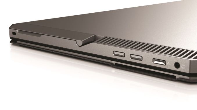
| Ports and Connectors | Left side: 1 x headphone/microphone combo Right side: 1 x Power Connector 1 x HDMI 1.4 1 x USB 3.0 Type-A (charging) 2 x USB 3.1 Type-C Thunderbolt 3 (DisplayPort 1.2) |
| Input Device | Backlit keyboard with function key control Image sensor clickpad with on/off button, two-way scroll, gestures, two buttons Extra large clickpad with on/off button, two-way scroll, gestures, two buttons |
| Camera | 720p HD webcam with IR (front-facing) 720p HD webcam (front-facing) 8 MP Camera (world facing) |
| Power | 90W External AC Power adapter 65W External AC Power adapter 4-cell 70Wh Li-ion polymer Up to 10 hours |
| Dimensions (W x D x H) |
14.25" x 8.94" x .8" (Laptop Mode) 14.35" x 8.94" x .57 (Tablet Mode) |
| Weight | Starting at 4.78 lbs (Laptop Mode) Starting at 3.64 lbs (Tablet Mode) |
Related Reading:
- Microsoft Introduces Surface Book 2: 7th/8th Gen i5/i7 and NVIDIA Discrete Graphics
- Best Laptops: Q3 2017
- Clevo Announces P870TM Laptop: First DTR Laptop with Coffee Lake-S
- HP Announces Omen X Laptop: 17.3" LCD, Core i7 + GeForce GTX with Overclocking
Source: HP




42 Comments
View All Comments
MrSpadge - Wednesday, October 18, 2017 - link
A "mobile workstation" with a 16:9 display, no 10-key block but lot's of empty space left and right of the keyboard? The Surface Book 2 with a quad core looks better IMO.ddriver - Wednesday, October 18, 2017 - link
16:9 is better for workstation software than 16:10 or 4:3. Most such software makes extensive use of the "sidebar".Higher power CPU options would have been nice. ECC support too. Larger battery too, at least 100Wh. The ability to use the kickstand as a carrying handle too.
The most negative aspect is they went nuts on the bezels.
guidryp - Wednesday, October 18, 2017 - link
16:9 sucks for everything except watching movies/TV.Productivity benefits from more square ratios. Especially in a tablet where you want to consider vertical usage.
Microsoft uses 3:2 which is decent compromise.
ddriver - Wednesday, October 18, 2017 - link
Nope, most prosumer software loves wide aspect ratios. To be honest, I'd rather have it even wider than 16:9.Graphics design, video production, 3d, engineering, audio production, even software development. All of it loves widescreen, all of it is extremely awkward and clumsy on narrow displays.
4:3 and 3:2 are more tailored to casual users and their usage patterns, not prosumers. Which is why overpriced toy makers like m$ and crapple make their products squarer - because they target casual generic users rather than prosumers.
Manch - Thursday, October 19, 2017 - link
That's utter nonsense. 16:9 lack vertical resolution. While perfectly suited for 1080p movies and games it has always been a compromise for productivity. If you have a monitor that allows it to be turned sideways for portrait mode, it was ok if you had at least a dual screen setup. 16:10 was preferred because you could have your wide format video pixel for pixel and still have enough room for a tool bar. 16:9 became prevalent bc the common std made it cheap. It was a compromise and still is.ddriver - Friday, October 20, 2017 - link
And 4:3 lacks horizontal resolution, which is more important for prosumer software. Toolbars... those are not as heavily leaned on in prosumer software as it is in casual usage software. Something like an office application has everything on the toolbar/ribbon. Now, an office application might sound like "prosumer" in your mind, but I can assure you it is not considered "prosumer" in the prosumer world.Prosumer software means a chunky sidebar, quite often two on both sides, that holds object properties, structure information or huge component libraries. That's an ideal for for widescreen, because it occupies that extra horizontal space, and you are left with a 3:2 or 4:3-ish workspace for the viewport.
Quite often such software also heavily relies on multiple viewports, so the wider the better, and when I say 16:9 is better I mean it is better than narrower aspect ratios. Wider than 16:9 is even better. IMO 8:3 or even 3:1 could be ideal, at about 18 inches of height for desk use, that would allow people that are currently using multi-monitor setups to get a single, continuous, uninterrupted, non-quantized workspace. A 6480x2160 in a 45"-ish form factor will be a personal dream come true for me.
And then we have the difference between "aspect ratio", "resolution" and "working space". 16:9 can offer ample vertical working space, just in case you have missed it, there are huge 43" 4k monitors which offer ample vertical working space.
Finally, when you go big, going wide is a much better deal, because first the human field of vision is significantly wider than it is taller, and second, moving your eyes and your head horizontally is much easier and natural.
Manch - Friday, October 20, 2017 - link
Prosumer software doesn't equate to chunky side bars. Most will let you reorder the toolbars. While 4k may becoming more prevalent, 16:9 1080 is still unfortunately what most people have. 16:10 is much better. That little bit of extra vertical resolution makes a big different. I'll agree that no one will miss 4:3 but 3:2 is great. Provides a wide enough screen without compromising vertical resolution.ddriver - Saturday, October 21, 2017 - link
Come back when you actually know what prosumer software is and have used some. It is brutally obvious you have zero clue what that is.And no, you cannot reorder sidebars, nor could their type of content possibly fit in a horizontal layout. And while most support temporary hiding, those stay open 99.99% of the time, as they essentially hold the bulk of the functionality, so it is extremely counterproductive to have them hidden.
Quite frankly the only 3:2 advocates are m$ fangirls, and the reason m$ opted for 3:2 themselves is because they neither target prosumers with their devices, nor do they make any prosumer software aside from visual studio, IIRC their main argument in support for 3:2 was because it was more browsing friendly, and just in case you might have the wrong idea, no, internet browsers are not prosumer software.
3:2 is a complete DUD for prosumers, heck even 16:9 is too little, which is why most prosumers use multi monitor setups, and just in case you were wondering, no, they are not being stacked vertically. Prosumers are buying 21:9 monitors like crazy, rejoicing they can finally get rid of some of those multi monitor setups, alas 21:9 is still not optimally wide. That would be 3:1.
Lastly, the hell no, prosumers do not use 1080p, that's where the low end of the mainstream is. Talking about prosumer software and bringing up 1080p is about as silly as talking about prosumer software without knowing what it is or using any.
Tams80 - Saturday, October 21, 2017 - link
Sorry, but how many people do you see spending significant amounts of time editing their videos with only a slim toolbar at the top or bottom? Most time is spent with the timeline and multiple toolbars visible, with the video relegate to a quarter of the display.Only on 4k displays is a 1080p video often edited with its true resolution shown. On mobile devices, the extra power drain of that 4k display is not welcome. Then when we get onto 4k footage...
As for art programs... have you seen the toolbars that flank the canvas? Extra horizontal space is definitely needed.
This workstation tablet is also clearly not designed to be used vertically. Nothing is designed to make it easy to use it that way.
Squarer aspect ratios are only really better for whole canvas drawing, handwriting, and coding (only really in a multi-monitor set up mind).
Inteli - Wednesday, October 18, 2017 - link
At least in the US, 100 Wh is the maximum capacity of a single battery that can be carried on an airplane per the FAA. It would have to be split up Surface Book-style. ECC support is dependent on Intel, and since Intel doesn't make any 15W (or 28W) Xeon parts that would be suitable in a tablet like this, it can't support ECC.I don't think massive bezels on a tablet are such a bad thing, since it gives you ample hand space if you actually want to use it like a tablet. I do agree that 16:9 is great for workstation applications. Taller aspect ratios work well for stuff like word processing and web browsing, but that's not what this is made for.